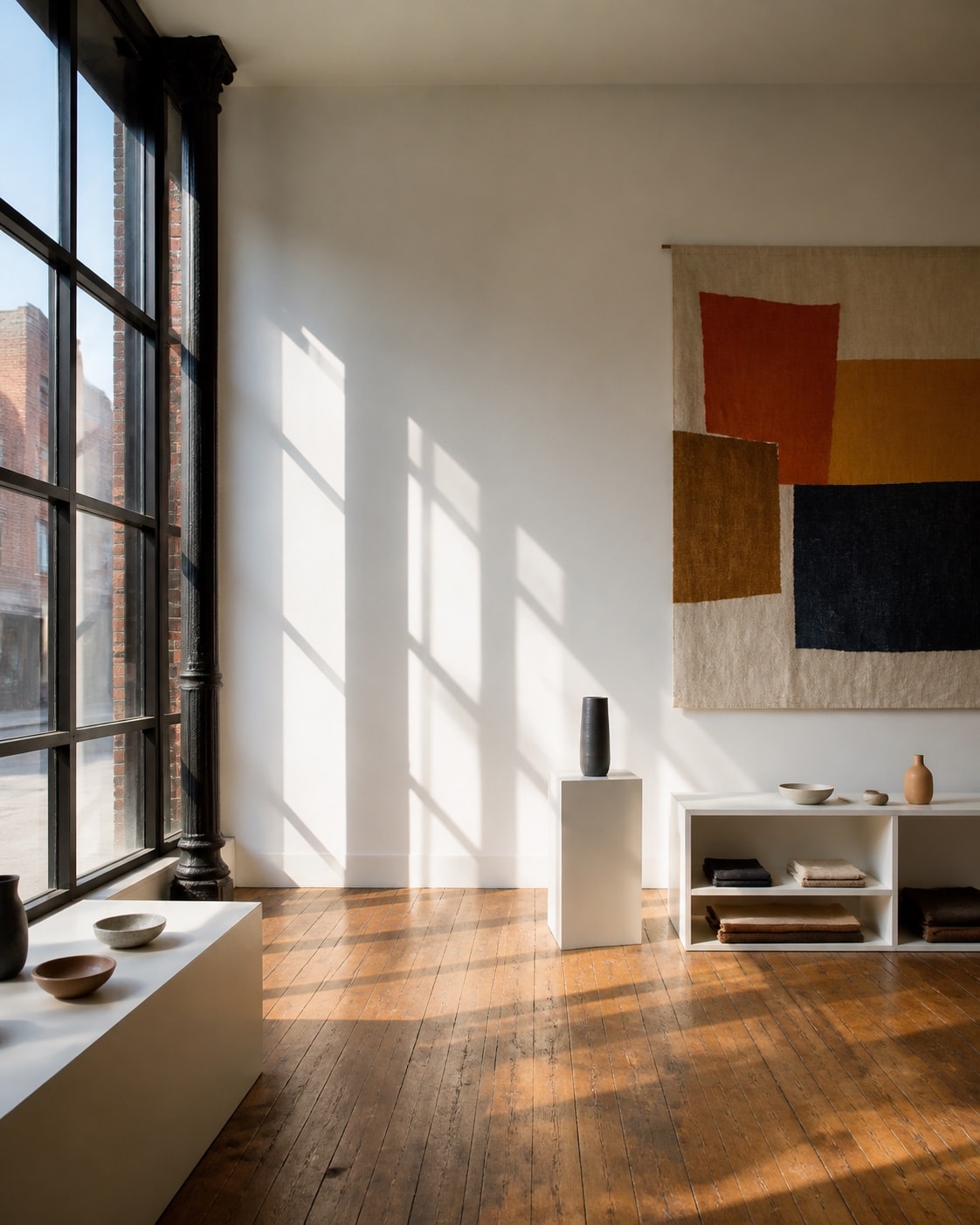
Volume Changes How Objects Read
High ceilings create more than grandeur. They increase the visual distance between merchandise and architecture, allowing tall art, suspended elements, or open wall space to establish rhythm. Small objects can be gathered into intimate zones without making the whole room feel compressed. In a gallery-linked shop, that contrast between broad volume and close looking can be especially effective.
Vertical space also creates practical challenges. Light must reach display surfaces without producing glare, and sound can become lively when hard walls and floors reflect it. A successful interior balances openness with quieter, lower-scaled areas where a visitor can study detail.
Hardwood as Historical Texture
Restored original hardwood carried visible age into the shop. Grain, wear, seams, and color variation can ground newer display elements and make a large room feel warmer. Yet historic material should not be romanticized at the expense of care. Moisture, grit, dragging fixtures, intense sun, and unstable finishes can damage old flooring. Changes to a historic building require assessment by qualified people familiar with its construction and local requirements.
The federal standards for rehabilitation explain a widely used framework for compatible new use and retention of historic character. The standards are provided as general context, not as an evaluation or certification of this particular building.
Connecting Shop and Gallery
A direct connection between the gallery and shop allowed each area to influence the other. Art could draw a visitor deeper into the space; a useful household object could be considered through the same lens of material and form. The transition itself likely mattered, even though its exact design is unknown. Changes in light, spacing, wall density, or object height can signal that a visitor is entering a different mode of attention.
The gallery and craft page discusses that mode of looking. It deliberately avoids named exhibitions because the available sources establish the gallery’s importance, not a complete artist or show record.
Flexible Display for an Eclectic Assortment
A varied shop needs a visual system strong enough to connect categories without making them uniform. Repeated plinth heights, a controlled base palette, consistent spacing, and clear paths can provide order. Color and personality can then come from textiles, artwork, ceramics, pantry objects, or seasonal material. This is particularly well suited to the documented Paula Brown Shop vibe: a restrained architectural shell animated by changing objects.
Accessible circulation is part of good display. Paths should remain clear, fragile objects should not project unexpectedly, and information should be readable without blocking movement. Current accessibility obligations depend on jurisdiction and scope. The 2010 ADA Standards for Accessible Design are an authoritative starting point for understanding built-environment requirements, though they are not a substitute for project-specific professional review.
Remembering a Place Through Documented Details
For the documented chronology behind the setting, read the shop history. For the evidence and its limits, see the source notes.
The most reliable architectural memory is modest: a large, high-ceilinged, hardwood-floored shop directly connected to a gallery in an older downtown building. That is enough to explain much of the experience without pretending the missing details are known.